Friday, September 16, 2011

I wish you the joy of loving

Today my son Neill turns 8 years old. He's been such a perfect addition to my life, the missing piece I didn't know I was missing until he arrived. Thank you, son.

For your birthday, I wish you patience. I wish you perseverance. And I wish you the joy of living. The joy of loving. I love you with all my heart!!!

I was going through my gallery thinking I'll just repost one of my old layouts, probably one showing him as a baby, to go with the short Happy Birthday message. Instead, I found this one that I consider one of my most favorite scrapbooking layouts ever. And it turned out that I haven't even shared this one on this blog yet! What's wrong with me? Duh???

The page is really special to me. You'll understand it once you read it.


Journaling reads:

"Starting Over"
Neill was not breastfed as a baby.


Back then, who knows how much I could have pocketed if I got a penny 
everytime somebody gave me a you're-not-trying-hard-enough look. 

My breast milk didn't come when Neill was born and for the whole first week 
we pretty much starved him because I was so determined to breastfeed. 
We really didn't have anything else prepared in case I couldn't do it. 
I had read so much about the advantages of breastfeeding 
and wouldn't give my son anything but the best. 

Well, turned out I couldn't give him that. 
I extended the hospital stay but in the end even the doctors and nurses gave up 
(without really saying so) and suggested that he should be given full-on formula. 
I couldn't even describe how much it hurt.

I know it's nobody's fault and it couldn't be helped. But sometimes I want to scream, 
'Enough with the look and don't try to make me feel less of a mother because of it!'

I would have given anything though, to go back and start over with all the breastfeeding struggles. 
But it just can't be done. That day when I gave Neill his first full bottle, I felt defeated. 
Then I realised that I was holding on to my ego instead of his needs. 

That day, we started over together. 
I learned that being a mother doesn't only mean pushing for the best, but also accepting the truth. 
And I hope Neill learned that eventhough it might not always work out in the end, 
I'd fight tooth and nail to give him the best I possibly can every single time.


The layout's journaling is inspired by this blog post by Trish (MommaTrish - she writes the best sarcastic parenting blog in my opinion.) I read her story and just had to tell my story as well. Thanks for the motivation, Trish!!!

The product used in the layout is "Anew" kit (retired) by my friend Rachelle. She used to be known as Studio Doodelle but now on hiatus from scrapbook design. You can still follow her insightful and fun personal blog.


* * * * * *

Just a little advertisement before I say goodbye for the day... :)


  • Val is hosting a challenge! You have a whole month to complete it. :) Oh, and did I tell you there's a free mini something for grabs at the challenge thread?

  • Anita is releasing this new beautiful kit: The Best Things in Life. I'm so sad I was so busy I didn't make a layout with it yet. But I will soon! For now, you can visit Anita's blog to take a closer look at the kit and a new set of templates too!


Bye for now! :)

Sunday, September 11, 2011

It's my party and I'll fly if I want to...

The title came to me out of the blue and I really quite like it. You'll find out soon enough what it's about. :)

Yesterday was my birthday (don't ask) and I had such a great time I decided I had to update the blog immediately to give you some gift and maybe brighten up someone's day a wee bit as well. Obviously "immediately" turns into 24 hours afterwards but you know that's not too bad considering my blog-updating history. LOL

First a few recent layouts to share!

**********

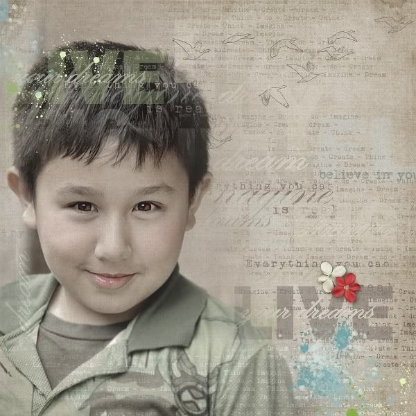
I just LOVE those word arts in Val C. Designs' new kit - Fly High. (You can choose to purchase the bundle or WA, papers, and elements separately.) They are so inspiring and make you wanna start scrapping the moment you laid eyes on them. Well, that's what I did!

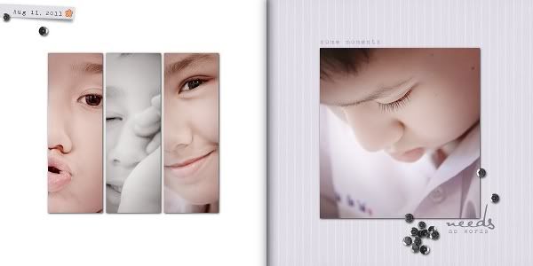
It was so much fun layering  and blending all the masks, word arts, stamps, textures, etc., on the page and came up with just an easy-looking one accentuating Neill's mesmerizing eyes. I think I'll be using the design as the cover page of our family 2012 calendar. 


**********

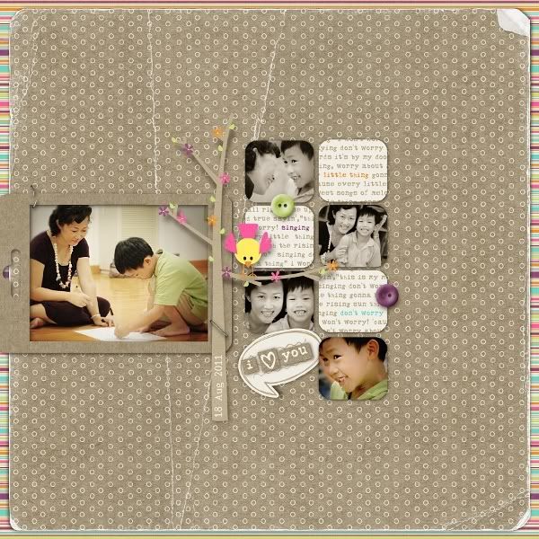
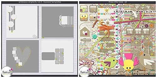
These following layouts are from Dunia Designs' templates and kits. For the first one I used one of her latest template set Embrace Simplicity vol. 3 with the Three Little Birds kit. It's a RAK for my close friend PaMam. The sweet and tender photos are from a Thai Mother's Day event at her son Sinat's school.


**********

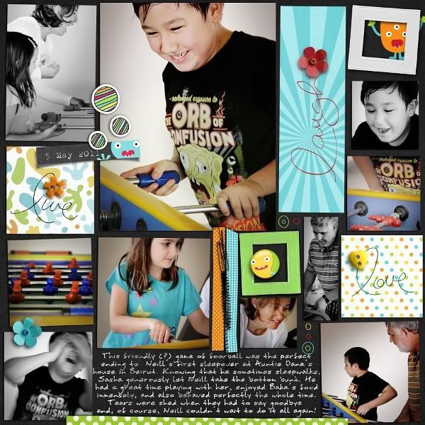
Now for this one below. The journaling says it all. ;)


May 5, 2011: This friendly (?) game of foosball was the perfect ending
to Neill's first sleepover at Auntie Dana's house in Beirut.
Knowing that he sometimes sleepwalks, 
Sasha generously let Neill take the bottom bunk. 
He had a great time playing with her, enjoyed Baka's food immensely, 
and also behaved perfectly the whole time. 
Tears were shed when they had to say goodbye
and, of course, Neill couldn't wait to do it all again!


Edited: Great, great news for Dunia's fans!!! From September 15 - 20, ALL her products  - old or new releases - are 30% off!!! Don't miss this chance. Visit her MScraps or DigiScrappersBrasil stores today!


**********


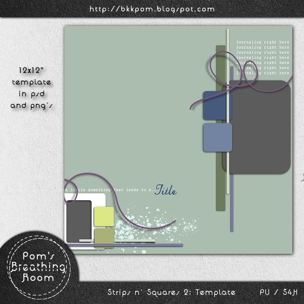
Thanks for sticking with me till the end! I've modified an old layout and turned it into a template for you. Hope you like it!
Edited to add: Just noticed that the layout that I based this template on was posted in galleries exactly one year ago! It also got a GSO at DigiShopTalk forum. I didn't post it at first because it doesn't really look a lot like the template anymore after the modification. But then I thought maybe it would show you an alternative way of using the template. So here it is!


Please click on the preview below to download. Enjoy!!! :)


Sunday, August 28, 2011

Today I'm grateful for...

So many things! I woke up feeling it's gonna be a good day, and it is so far. :) Outside the air is heavy and the grey sky threatens rain while I'm enjoying my cup of latte in an air-conditioned mall with free wi-fi waiting for my kiddo to finish his singing class. Yes. All is well.
Just about an hour ago I learned that my most recent scrapbook page made it to the Gallery Standouts blog again today!

It's always an honor to be among such amazing talents there but today it's very special because the page is also very special to me. Well, to be fair, all my scrapbook pages are special to me. But you know, like that bad joke, "All men are created equal but some are just more equal than others."

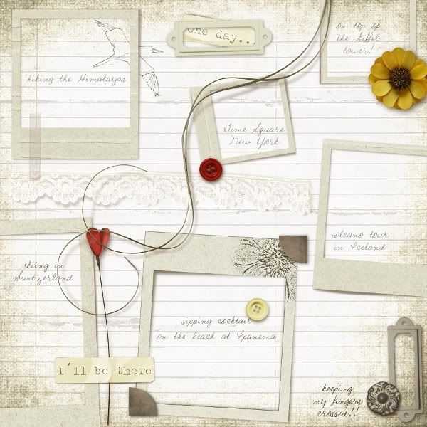
This page happened quite spontaneously. I didn't set out to create a photo-less layout but it just turned out this way. It became a page waiting for myself to fill one day with photos taken from my dream destinations. Would you keep your fingers crossed for me please...


Do you like my list? Anyone share the same dream destinations as mine? :)

The page is crated with Val C. Designs' amazing For the Record kit.


*****************

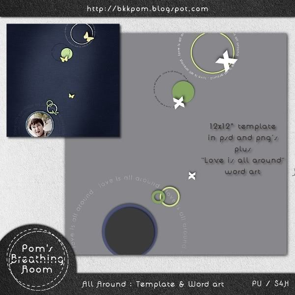
Now I hope I can make you happy too. :) There's this little template I made from my own layout. I kept it simple but of course there's a lot of space for you to fill out with as many elements, photos, and texts, as you want to. I made a word art to go with the template and it also works separately. So, enjoy!
The template and word art are okay for PU, S4H, and S4O. Please click on the preview to download.


Tuesday, August 23, 2011

easy or busy, and some word art freebies :)

Easy or busy? That is the question. How do you like your layouts to look, digiscrapping-wise? I personally love both. I just can't limit myself to any one style. Yeah.. I'm quite promiscuous when it comes to designing. LOL

Over the years I've noticed that a lot of those who love C&S (clean and simple) style don't usually wander far from it. In similar fashion, those who marvel at busy layouts seldom scrap anything without clusters either. I might be of a rare breed as I'm inspired by both groups and always enjoy stalking galleries of these amazing scrappers.

And that's one great thing about being in Dunia Designs' Creative Team. She is a C&S scrapper herself so she always releases amazing templates in that style. On the other hand, she designs perfect kits for those who love lots and lots of busy elements on their pages. Result? She's got a great group of scrappers of all styles working for her and together they are truly a bottomless pit of inspiration for me.

**********

So, layouts I have to show today are of course from Dunia's creations. Some looks easy (though none really are) and some busy. (Didn't I tell you how promiscuous I am? LOL) Hope you like them!

I'll start with the most recent ones.


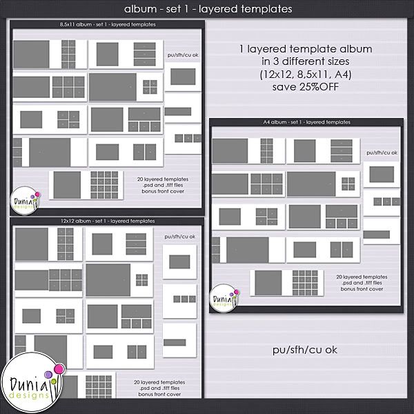
You can click here and here to see these double pagers in bigger size. They are created with Dunia's Album - Set 1 templates (available at MS and DSB) which had me screaming at first sight. :) I'm planning to use the whole set to create the family calendar for 2012.


***********

Now this one is pretty special. I don't scrap my husband that often (well I'm quite shy to be so openly lovey-dovey LOL) but when I got an idea to do a white-space layout with very little journaling, I know this is the theme and photo for it.


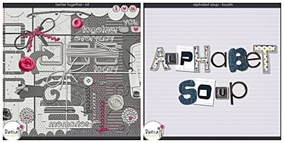
The kits used are Better Together and Alphabet Soup: Boyish.


*******************

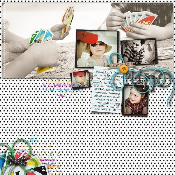
The next two pages were created in June. (I know. I know. I should blog more regularly.) Both got mentioned in MScrap's June GSO thread. And both tell the story of the day Ella's family came to visit us in Bangkok. :)


^ Created with Somewhere over the Rainbow collab by Studio Basic and Dunia, Embrace Simplicity vol.2 template, and Alphabet Soup - Girly


^ Created with Positive Vibration kit and Duo Stripes template

**************

Are you still hanging in there? :) Sorry for this being an image-heavy post. Next time it should be better as I've cleared the backlog with this one. ;)

So, to thank you for sticking around to the end of the long post, here's a word-art pack for you. I created them over a period of time for my own layouts then put them together as a prize for a challenge I hosted last year. Only about a dozen people have them so far and I'm sure they don't mind I'm giving the pack away as freebie now.

Please click on the preview to download. I hope you like it. :) Enjoy!!


Sunday, August 21, 2011

For the Record RAK from ValC.


Just a quick post now and hopefully I'll have another post up later in the day. :)

Val C. Designs went for a vacation (which made me green with envy LOL) and came back with this sweet, classic, neutral colored, and perfect-for-photobook kit called "For the Record." It's just stunning and so versatile. I wish I can show you the preview and the layout I made with it right now but I can't. Yet. You'll just have to wait a bit more.

But now you can join in for a chance to win this kit for free! Visit Val's blog and read how. The RAK will close this Thursday and winner announced on Friday. Good luck!


Sunday, August 14, 2011

Frames and a good sale, anyone?

I need to find a way to come up with more creative and fun titles. LOL

Been super busy in real life and haven't done any scrapping for a whole week. :( There's still quite a few recent pages that I haven't shown here, though. Will do that very soon but today it's gonna be just a short post.

*******

One of my lovely blog visitors, Terri, wrote to ask about a set of frames that I created last year as a participation gift for a challenge I hosted at Digital Scrap Cafe. The link in that post didn't work anymore because, not too long afterwards, DSC had a server problem that caused them to restart the whole forum, lose all the old threads, and start afresh.

Her mail reminded me that I had thought about re-posting the links to the stuff I gave away through DSC earlier but kept forgetting about it.

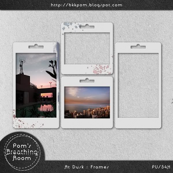
So, thanks to Terri, if you'd like some loose frames versatile enough (I hope) to use with many kits in your stash, here they are. I call them "At Dusk" as some photos I took of Beirut after sunset were my inspiration in creating them. :)

The frames are for okay for Personal Use and Scrap for Hire. Please click on the preview to download.


*********

I'll wrap it up with a great news for Val C. Designs' fans!

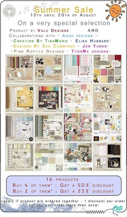
From August 13 to 20 you can have the selected products at as much as 50% off the price, exclusively at Zig Zag Scrap. I have to say this news earned a "Wow!" from me when I first learned of it. A sale this big that include all the big collabs and mega bundles are hard to come by these days, if at all. So take this opportunity and enjoy your retail therapy! Oh, and if you want to see what you can do with Val's designs, a visit to the ZZS gallery might help. ;)


Be back soon. :)

Sunday, July 31, 2011

Challenges, layouts, and a freebie

I definitely didn't plan it but when I looked at all the layouts I want to show you today, I realized they were all created with prompts from challenges!

What I love the most about challenges is how they push your creative boundaries. You get to do what you might not normally choose to do, try new techniques, and sometimes even explore some of your own buried feelings. I'd recommend it if you haven't tried yet.

I've totally enjoyed the challenges at MScraps forum where I hang out the most these days. They are creative and challenging (as challenges should be), and the sample layouts from the site CT's are very inspiring. Oh, and of course, the points that you can collect toward $ to use in the store are quite nice too. ;)

...................

Did you happen to notice the tweet button on the right side of the blog? Hehe...yep, I'm using twitter now. In my twitter page I use this layout as background.


I created this LO for an About Me challenge in the theme "Phobia" and that means heights for me. It was a long process thinking, planning, and executing the page, which is why I just love how it came out looking so simple and easy. The ladies at MScraps gave me so many encouraging comments!! TYSM!

(The city silhouette is inspired by Famous City Skyline brushes by Rawox and Balloon girl modified from a brush by xCassiex24. Thank you both!)

Just 2 days later I created another page for the Photography challenge: reflections. Mine was taken on our short train ride 2 years ago. It shows not one but two reflections! One on the magnifying glass and one in my son Neill's eyes, and I just love how I can see myself in his eyes!


The page went on to earn a mention in the Gallery Standouts blog! I was so excited!!!

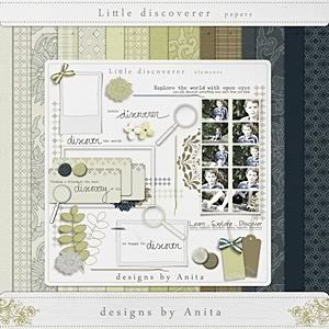
Both pages above were created with this beautiful kit: Little Discoverer of Designs by Anita.


...................

For this month (July) I have 2 challenge layouts to show. :)

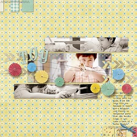
This first one I made for the Recipe Challenge. Not food but scrapping recipe - with a certain amount of photos, papers, fasteners, lines, circles, etc. you have to put in. Not easy at all but so much fun!!!


Journaling reads: Neill isn't normally allowed to play with toy guns.
I let him have this one because it hasn't got a trigger
and there're no dangerous parts that can become loose.
It can make a heck of a noise though.

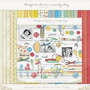
From collab kit Things to Do on a Windy Day of Designs by Anita and Che Yang Designs


...................

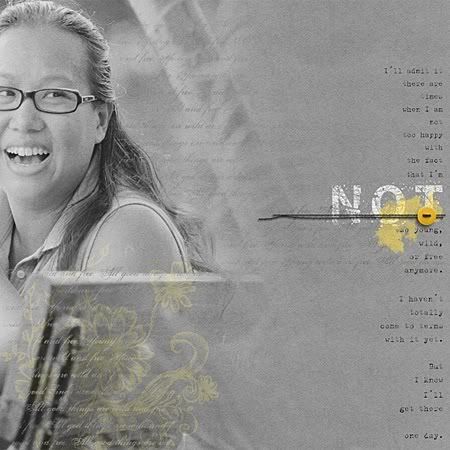
And the most recent one is another About Me challenge. This time it's about what you dislike about yourself. Oh boy. I have to say, when it's done, I felt so drained and naked! LOL


Journaling reads: I'll admit it
there are times when I am not too happy with the fact that I'm
NOT so young, wild, or free anymore.
I haven't totally come to terms with it yet.
But I know I'll get there ... one day.

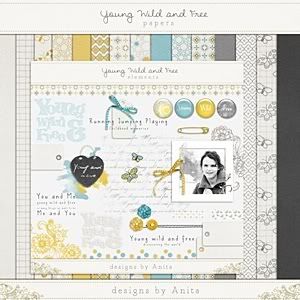
From kit Young, Wild, and Free of Designs by Anita


...................

Now a little bit of news!

Two Little Pixels is closing shop so all Anita's products there, including the ones you see here, are now on sale at 35% off! This is only until August 5 so hurry up!!

...................

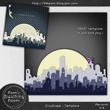
Congrats! You've survived the loooong post. Here's a present for you. As I said, I spent a lot of time planning, drawing, cutting and piercing those digi papers to make the layout so I think, well, maybe you can find some use for it! :D Here's the download link if you're interested:


Just a little reminder here: this template is for Personal Use and NOT for any promotional purposes. So, please refer to the TOU when using. :) Thank you so much! Please let me know if you do make something with this. I would really love to see your art. :)

Friday, July 29, 2011

a template freebie and some other things

  1. I seem to be apologizing and making excuses about why I didn't blog more often every time I update the blog. So I'm not gonna do that today. I'll just.... blog. LOL

  2. I've been busy with my son Neill's many after-school activities. (Isn't that an excuse too? Oh well..) Among other things, he recently participated in a singing contest and even won a small prize! I'm so proud of him! :)


    I haven't uploaded the video clip of the contest yet but here's his previous performance of the same song 'Whataya want from me' by Adam Lambert. Enjoy, if you have a few minutes to spare. ;)


  3. I created this layout for Val C. Designs almost a month in advance before the product hit the store. So when it eventually came out, I completely forgot about it. Bad, bad me! (So sorry, Val!) Anyway, here it is:


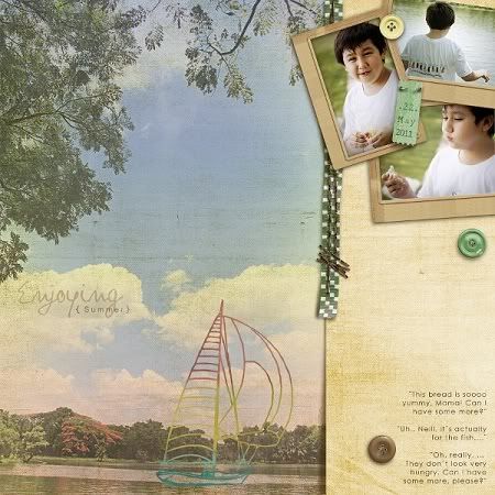
    Enjoying Summer

    "This bread is soooo yummy, Mama! Can I have some more?"
    "Uh.. Neill, it's actually for the fish..."
    "Oh really? ... They don't look very hungry. Can I have some more, please?" :)


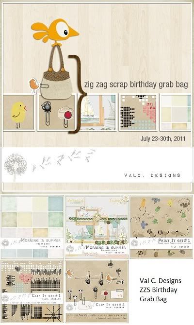
  4. The kit I used is Morning in Summer. It's now available as a part of Val C. Design's Zig Zag Scrap Birthday Grab Bag, until the end of July. Afterwards you can of course purchase it as a single product.


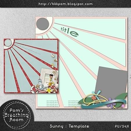
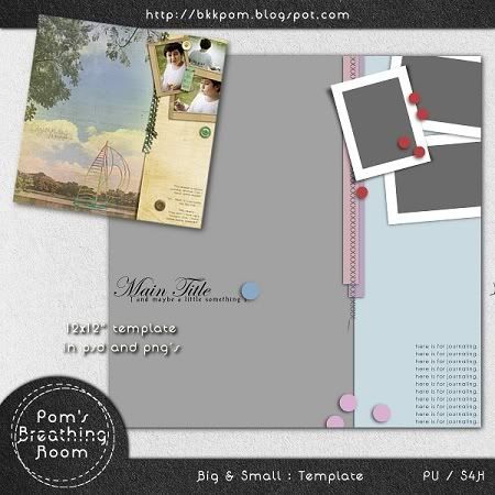
  5. I made a template out of the layout above. It's a gift for you. Hope you like it. Just click on the preview below or here to download.


    I also have another template to give away in a day or two. See you then. :)


Tuesday, July 12, 2011

Party in the summer rain

Nobody can tell anymore what color my car is exactly. :D Since it's been raining cats and dogs almost everyday here in Bangkok, I've decided to forego the pointless act of washing the car altogether. (Or at least until my son can't take it any longer and has to wash it himself. LOL)

Well, when it's not raining, it's just so darn hot here. I guess it's the perfect reason to be in an air-conditioned room and do some scrapping! I'm so in love with a lot of scrapbooking kits coming out right now. The bright summer colors certainly liven up galleries that it's such a joy to browse around.

Anyway, in the midst of sun and rain, I created a few double page layouts I'd like to share here. :)

P.S. Just notice that I put "Summer Rain" on the title! Love the song! Love you, Mr. Schue!

* * * * *

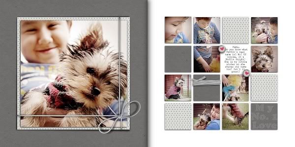
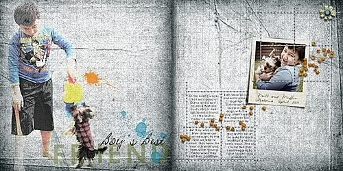
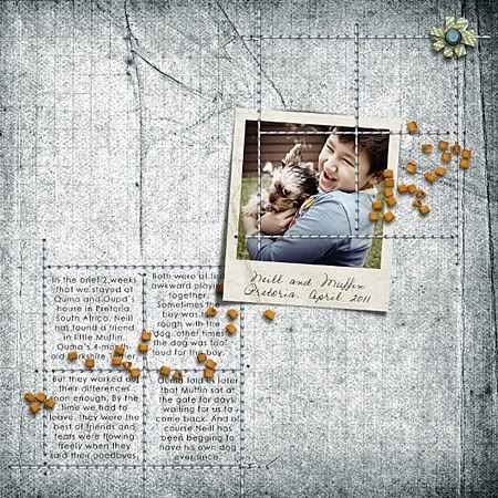
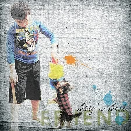
We went to South Africa in April to visit Ouma and Oupa (my mother- and father-in-law) and had such a great time there. I took a whole bunch of pictures from the trip which you'll definitely see later in my layouts. This one is about their new dog, Muffin, whom Neill created an amazing bond with...


Journaling reads:
In the brief 2 weeks that we stayed at Ouma and Oupa's house in Pretoria, South Africa, Neill has found a friend in little Muffin, Ouma's 4-month-old Yorkshire Terrier.

Both were at first awkward playing together. Sometimes the boy was too rough with the dog, other times the dog was too loud for the boy.

But they worked out their differences soon enough. By the time we had to leave, they were the best of friends and tears were flowing freely when they said their goodbyes.

Ouma told us later that Muffin sat at the gate for days, waiting for us to come back. And, of course, Neill has been begging to have his own dog ever since.

Credits:
layout created with Bloom of Colours kit by Val C. Designs

* * * * *

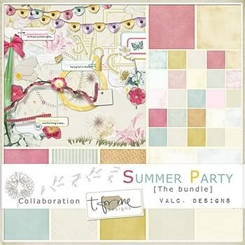
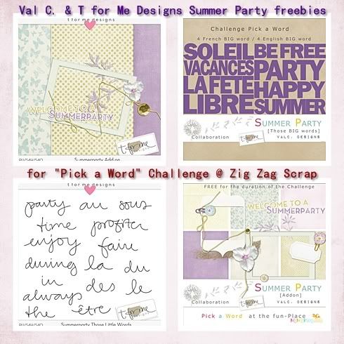
Val (Val C. Designs) and Terese (T for Me Designs) have teamed up to create this lovely kit called Summer Party.


They've also come up with a fun challenge with loads of freebies (add-on from both designers plus 2 word art sets in English and French) for us all to play with
and prizes to win.


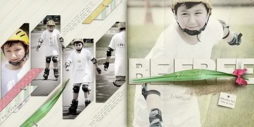
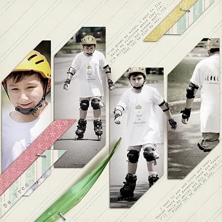
I had soooo much fun creating my double page layout for the kit and the challenge. :)


Come to the party at Zig Zag Scrap and join the challenge here!

I'll be back in a few days with my own template freebie. ;)

Saturday, July 9, 2011

Back with a bang - LO's, a GSO, and a freebie


I took a 5 month scrapping (and blogging) break and coming back to it again isn't easy at all! It's quite a struggle actually. :) Well, however, you know what they say about riding a bike, right? Just take a few falls and you should be fine. Keep your fingers crossed for me please!

* * * * *

The first few pages I created after my "comeback" were for Anita of Designs by Anita. I love the cool, calm, and collectedness of her products, they absolutely make me feel more cool-headed than I usually am. LOL So here they are:

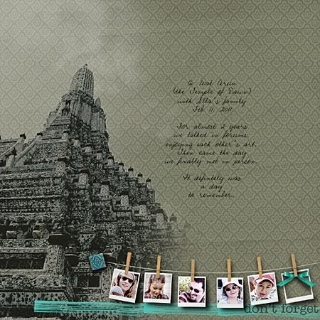
This first one is about the day Ella, my French digi-scrap friend, and her family were visiting us in Bangkok. It even earns me a mention in the Gallery Standouts blog! Woohoo!


Journaling reads:
@ Wat Arun (the Temple of Dawn) with Ella's family - Feb 11, 2011
For almost 2 years, we talked in forums, enjoying each other's art.
Then came the day we finally met in person.
It definitely was a day to remember.

Credits: Manic Monday - collab kit of Designs by Anita and Click Photo Designs Lien
(in Something Everyday bundle)

* * * * *

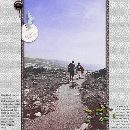
Then there's this layout created for a photography challenge at MScraps. You actually don't have to scrap the whole page for the challenge but I just couldn't help it. The picture begs to be scrapped! ;)


Journaling reads:
Byblos: March 24, 2010
This 2,000-year-old port on the Mediterranean Sea is just a short drive from Beirut.
Neill, Michael, and Papa hiked up and down the ruins tirelessly
while Mama brought up the rear snapping away.
On that small path, with the modern Beirut as backdrop,
it's almost like taking a journey through time from the past to the future!

Credits:
Chirping Birds - collab kit from Designs by Anita and Sabrina's Creations

* * * * *

Now for this one I just wanted to keep it clean and simple to set off Neill's wicked smile. :)


From Unique kit of Designs by Anita at Zig Zag Scrap

Good news! If you like this page, you can have it as a quickpage for FREE. Just visit Anita's blog here to download.

* * * * *

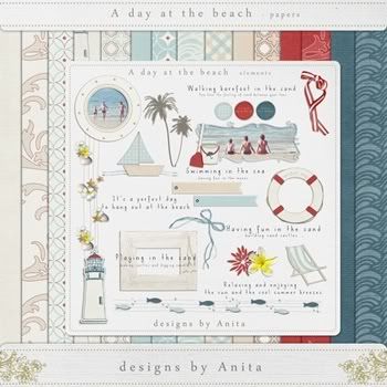
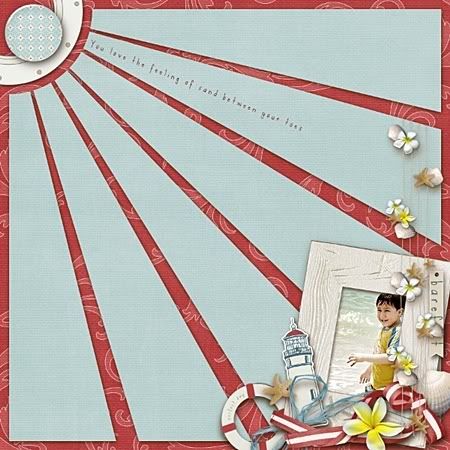
And this last one was created with a very special kit. As Anita is the Featured Designer at MScraps this month, she has created the kit A Day at the Beach especially for the occasion. Throughout July only, purchase more than $5 of Anita's products and you will get this fun summer kit for FREE!


Here's my page with the kit. Just wanna try to do a bold and busy page for a change. ;)


And here's a little something for you. Just to say thanks for visiting me again after my long break. You can click on the preview to download or just click here.


Enjoy the template and please let me know if you like it! :)

More to come very soon. Stay tuned!